Statify
Visual, No-Code Statistics.

TL;DR
Statify is a web-based tool that empowers economic researchers to efficiently explore, and analyze variables in the Survey of Consumer Finances (SCF) dataset without writing code.
The SCF is a complex dataset with thousands of coded variables, and researchers previously spent over 40+ minutes just to identify and understand a single variable. Statify simplifies this with a guided preference selection flow, interactive visualizations, and instant data previews.
MY ROLE
As the UX Engineer, I led end-to-end user research, crafted the interaction design, and developed the front-end architecture using React and D3.js, translating research insights directly into functional, data-driven UI components.
IMPACT
Watch the highlights.
Discover the right variables with only a few clicks.
Run statistical analysis without referring to the codebook.
Question? Ask the custom trained AI assistant.
THE PROBLEM
Researchers spent hours navigating a confusing codebook.
When I was a research assistant helping Dr. Ken-Hou Lin analyze SCF datasets, I noticed the poor codebook usability made data discovery slow and challenging, even for experienced researchers.

SO I ASK
Is there a better way to explore and analyze the datasets?
I then conducted user research within the sociology department to gather data on user needs and pain points to guide design decisions.
USER RESEARCH FINDINGS
After 6 interviews, I found...
PAIN POINT DEEP DIVE #1
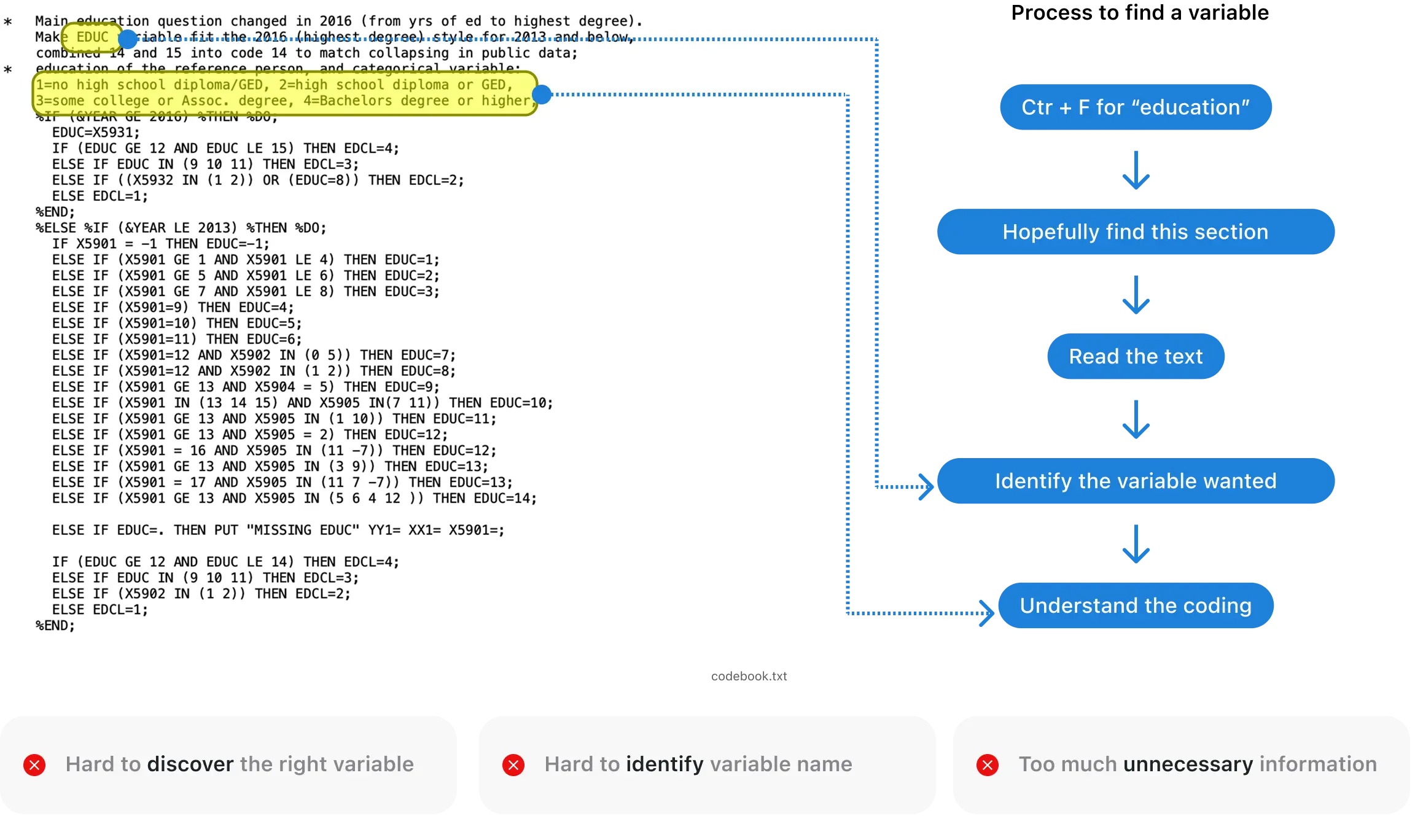
Codebook makes variables hard to find.

PAIN POINT DEEP DIVE #2
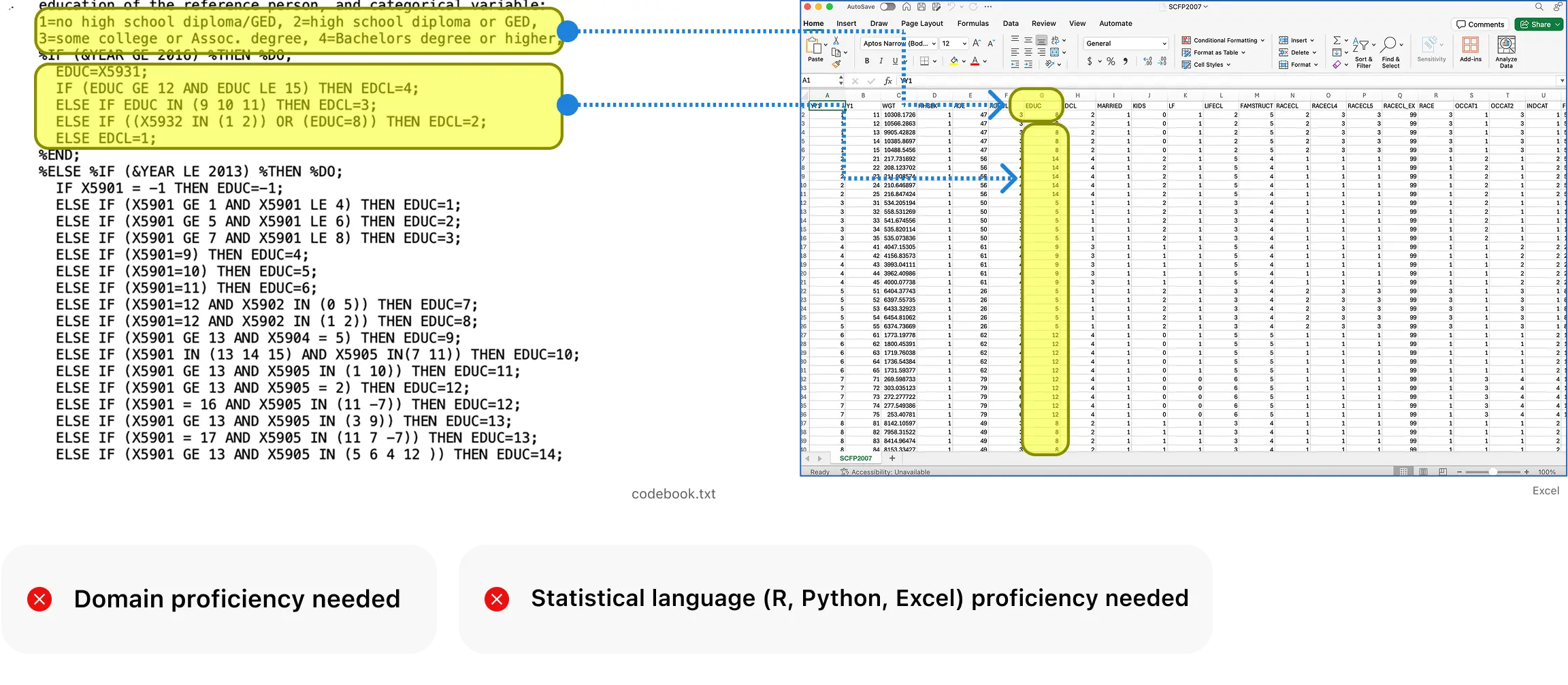
Complex tools and confusing codebook slow down analysis.

HMW
How might we help users better understand the codebook, find variables faster, and make it easier to do statistical analysis?
DESIGN GOAL #1
Turn the codebook and dataset into a more accessible, explorable format.
6/6 users prefer exploring data visually, if there's a way to do so.

DESIGN GOAL #2
Streamline data analysis.
Users need a easier data analysis workflow.

INITIAL PROTOTYPE
Find the right variable and do data analysis.
User can visually identify the desired variables with descriptions and add them to the analysis.
ITERATION #1
Visualize more variables with a concentric map.
Usability testing showed that users preferred the concentric map, that it is more visually interesting and intuitive.

ITERATION #2
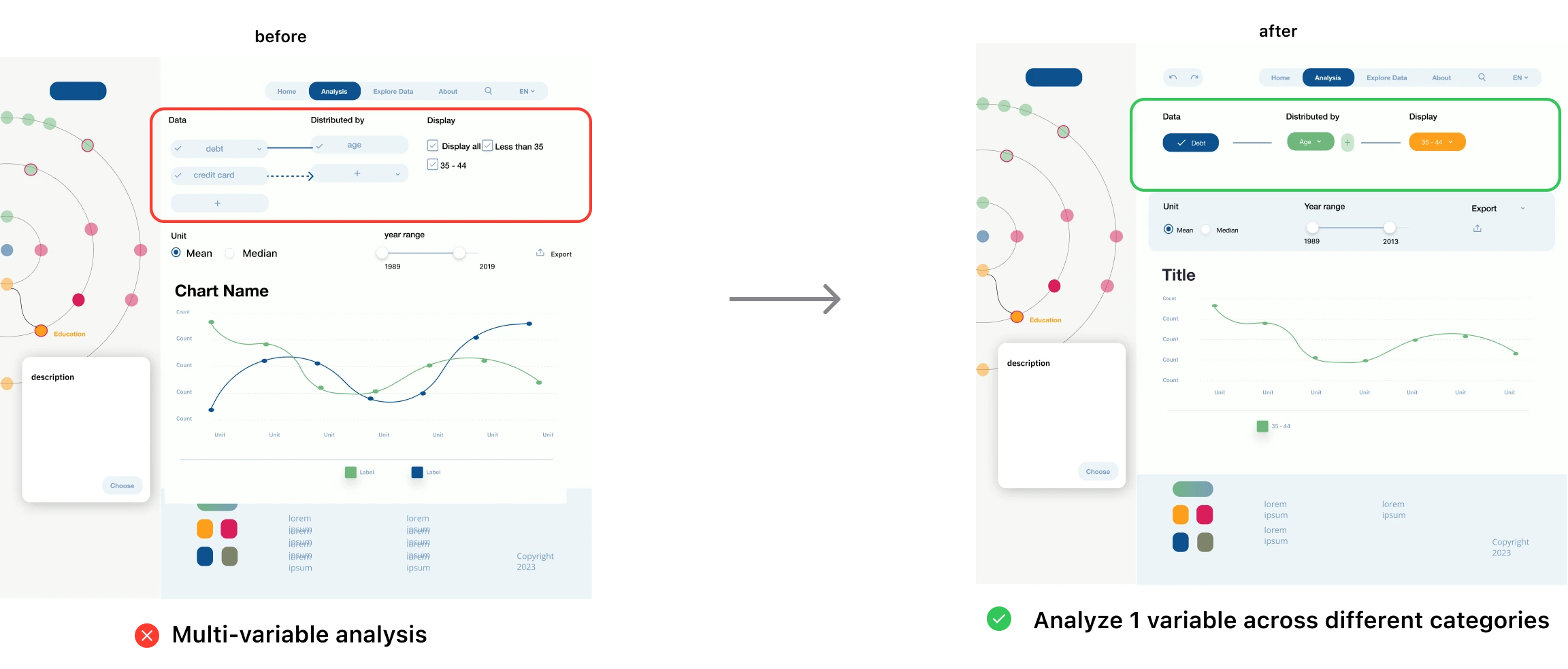
Users prefer exploring one variable (e.g., income) by categories over comparing multiple variables.
Users find it easier to focus on one variable at a time, viewing it across different categories, rather than comparing multiple variables simultaneously.

FINAL PROTOTYPE
Functional prototype ready for development.
DEVELOPMENT
My tech stack:
Final Product
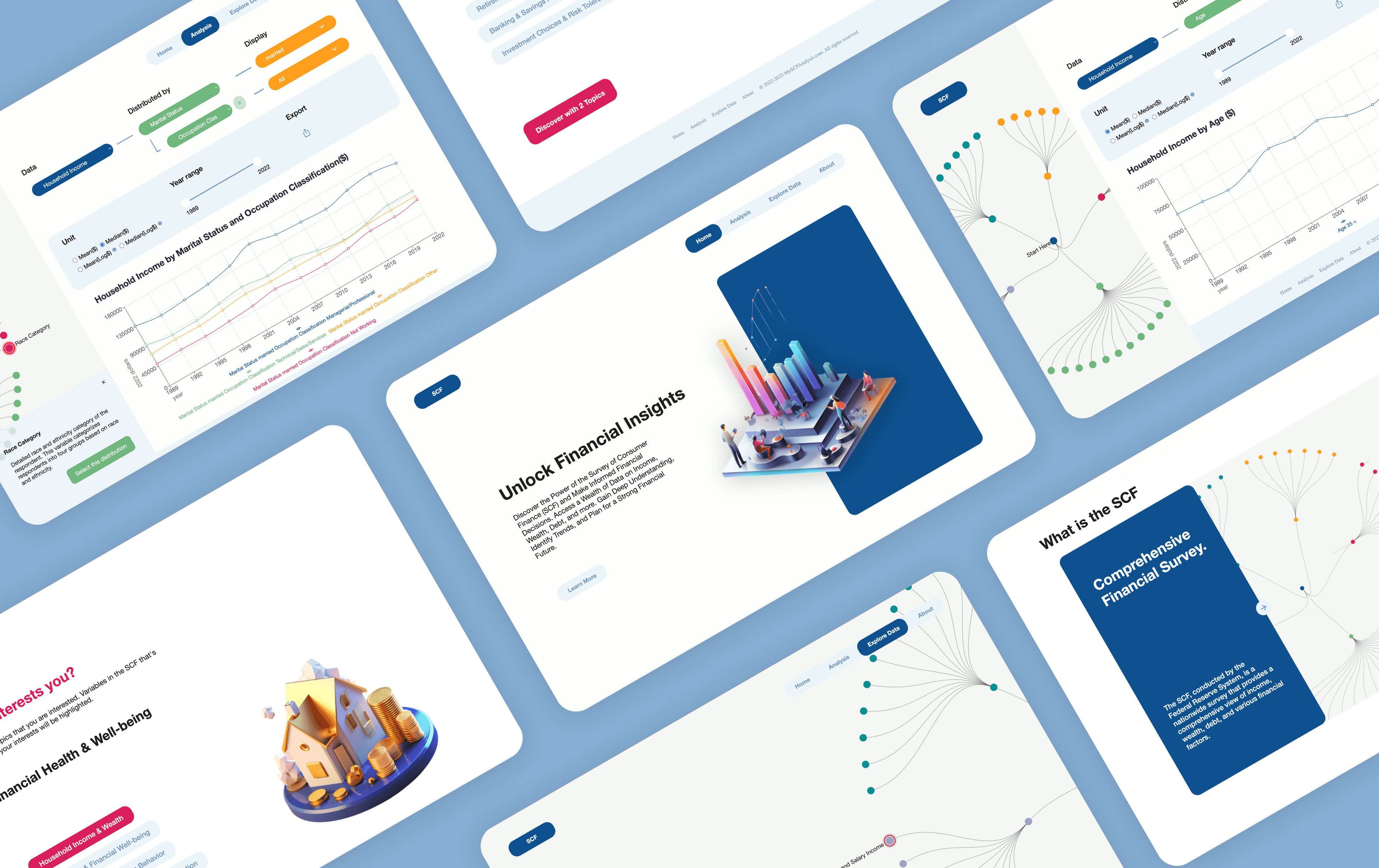
Statify is a React-based web app that simplifies exploration of the SCF dataset through intuitive preference selection and interactive visualizations.
USER FEEDBACK
After using the app, users said...
Understanding user pain points isn’t enough — it’s equally important to understand how users want to integrate new tools into their existing workflows. In this case, users didn’t want to adopt an entirely new system, but to enhance the one they already use.
Effective User Research Techniques:
- I learned to apply new user research techniques—such as competitive analysis, semi-structured interviews, and artifact walkthroughs—to map researchers' workflows and uncover deeper pain points.
I am currently extending the tool to support more features and datasets.